
For most small service businesses, a single-page booking hero or an embedded multi-service catalog converts best, with a multi-step flow reserved for appointments that involve add-ons or staff selection. Copy any of these three patterns and you are already ahead of the half-finished booking pages most competitors ship. Before you look at a single example, here’s the checklist to hold every design against:
- A CTA that names the action (“Book a Massage,” not just “Submit”)
- Availability shown before the visitor has to click into a calendar
- Price or a price range visible without requiring an account
- Calendar sync (Google Calendar is the default most clients expect)
- A payment step that supports Stripe or an equivalent processor
Pro Tip: If you’re building on Expressbook, the mobile app and voice agent handle two of these boxes automatically, availability display and accessible booking, so you can spend your design time on copy and layout instead of infrastructure. Pair that with the platform’s pay-as-you-go credits and you can test a redesign without a subscription.
Key Takeaways
The booking pages that convert best pair a layout matched to service complexity with a fold that shows availability, price, and a specific CTA before asking for personal details.
| Point | Details |
|---|---|
| Match pattern to complexity | Use single-step for one service and one price; save multi-step for staff choice or add-ons. |
| Show price and availability early | Display both before any personal information is requested to cut abandonment. |
| Cap form fields at five | Push non-essential fields to a post-booking confirmation screen instead. |
| Test before committing | Run CTA wording and single-step against multi-step tests before a full redesign. |
| Expressbook as the build path | Branded booking pages sync with Google Calendar, Stripe, and QuickBooks or Xero, with a mobile app and voice agent included. |
Table of Contents
- Booking Page Examples by Layout Pattern
- Real Booking Page Examples Worth Copying
- What Belongs Above the Fold on Your Booking Page
- Choosing Between Single-Step, Multi-Step, Modal, and Hosted Booking
- Turning Your Booking Page Into a Measurable System
- What the Design Data Actually Says About Booking Pages
- Build These Booking Page Examples Without Starting From Scratch
- Frequently Asked Questions
- Sources
Booking Page Examples by Layout Pattern
Every effective booking page borrows from one of a handful of proven layouts. Picking the wrong one for your business model is the single most common reason booking pages underperform, not bad colors or weak copy.
1. Single-service hero
A single-service hero puts one appointment type, one price, and one calendar widget above the fold. Think a massage therapist or a single-treatment aesthetician. Best for: solo practitioners with one core offer. Pros: zero decision fatigue, fast load times. Cons: doesn’t scale if you add services later, can feel sparse for established brands. Host it rather than embed, since the whole point is a distraction-free page.
2. Multi-service catalog
This is the grid or card layout you see on salon and spa sites, each service with its own thumbnail, duration, and price. Best for: salons, gyms, and clinics with five or more bookable services. Pros: lets clients browse before committing, doubles as a menu. Cons: more design work upfront, risks clutter on mobile if cards aren’t sized carefully. Embedding works well here if your main site already has strong navigation.

3. Multi-step wizard
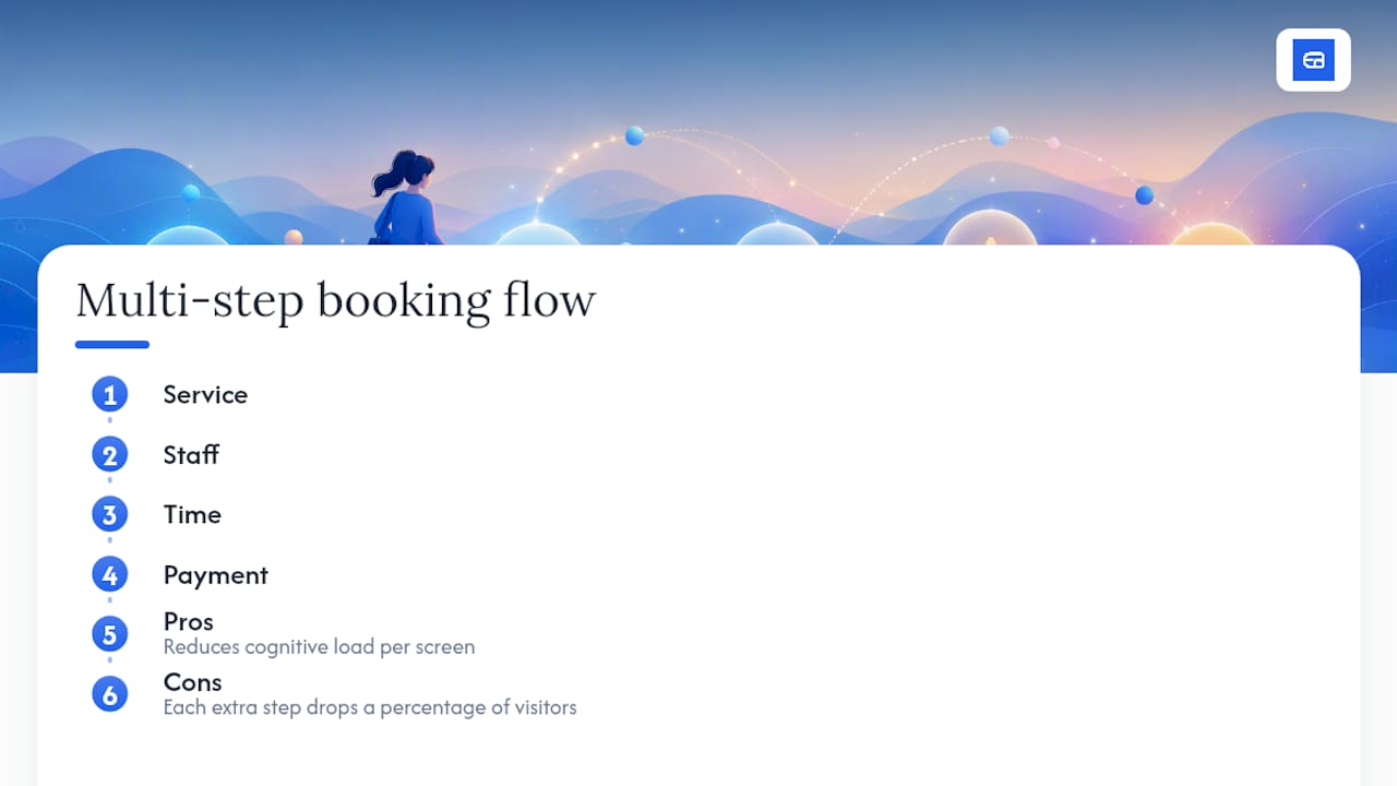
Booking happens in stages: service, then staff, then time, then payment. Best for: businesses with add-ons or staff preference, like tattoo studios or physical therapy practices. Pros: reduces cognitive load per screen, good for complex bookings. Cons: each extra step drops a percentage of visitors, so it only pays off when complexity genuinely demands it.
4. Slide-out panel
A booking widget that slides in from the side of an existing page rather than taking the visitor to a new URL. Best for: service businesses that want booking available from every page without a full redirect. Pros: keeps visitors in context, feels modern. Cons: harder to make fully responsive on small screens, can conflict with other page scripts.
5. Embedded widget
A booking form dropped directly into an existing website, often via iframe or JavaScript snippet. Best for: businesses that already have a content-rich site and just need a booking function bolted on. Pros: fast to implement, no separate hosting. Cons: design flexibility is limited to whatever the widget provider allows. Jotform’s booking form library is a good place to see this pattern in action, since many of its templates ship with calendar and payment widgets built in.
6. Sidebar booking
A persistent booking module that sits beside your main content rather than replacing it, common on consultant and coaching sites. Best for: service providers whose homepage does a lot of explaining before the visitor is ready to book. Pros: doesn’t force a decision, supports longer sales content. Cons: lower visibility than a hero placement, easy to overlook on mobile.
7. Landing-page booking
Built for paid traffic, this pattern strips out navigation entirely and puts one offer and one CTA on the page. Best for: service businesses running ads or promotions. Pros: highest focus, easiest to A/B test. Cons: not meant to double as your main site. Landingpageflow’s collection shows how these acquisition-driven pages differ from a standard booking page built for organic visitors who already know your brand.
Whatever pattern you choose, build mobile first. Most booking traffic now arrives on a phone, so test the date picker and payment fields on a small screen before you finalize desktop styling. Surface staff selection and add-on pricing only after the core service and date are chosen. Front-loading every option at once is what turns a clean single-service hero into a cluttered multi-step wizard by accident.
Pro Tip: Run your booking page through a screen reader once before launch. It takes ten minutes and catches problems, unlabeled buttons, missing alt text, that cost you bookings from visitors using assistive technology.
Real Booking Page Examples Worth Copying
These examples group by industry because the right pattern for a spa rarely works for a consultant. Pull the specific takeaway from each, not the whole design.
Wellness and salons
- Single-treatment massage page. A hero image of the treatment room, one price, one “Book Now” button above the fold. Takeaway: cut every service down to its own dedicated page if your catalog is small enough to support it. Inspect similar layouts in 99designs’ booking gallery.
- Spa multi-service grid. Cards for facials, massages, and body treatments, each with duration and starting price visible without a click. Takeaway: show duration next to price, since spa clients plan around their schedule as much as their budget. A dedicated spa and wellness booking system can generate this catalog layout automatically from your service list.
- Barbershop staff-select flow. Client picks a barber by photo before picking a time, because regulars care who cuts their hair. Takeaway: put staff photos before the calendar when loyalty to a specific person drives repeat business.
- Yoga studio class-pack page. Sells punch cards and drop-in classes side by side with a toggle between “single class” and “10-pack.” Takeaway: if you sell packages, let visitors compare per-class pricing without leaving the page.
Rentals and experiences
- Kayak rental with a renamed CTA. Swapping a generic “Book Now” for “Book a Trip” measurably shifts how visitors perceive the experience they’re about to have, according to Booqable’s review of booking page copy. Takeaway: match your CTA language to the emotional register of the service, not just the transaction.
- Equipment rental multi-day calendar. A calendar view that blocks out unavailable date ranges instead of forcing single-day selection. Takeaway: for multi-day bookings, show a range picker up front so clients don’t have to guess availability.
- Guided tour landing page. Paid-traffic page with one tour, one price, testimonials stacked below the CTA. Takeaway: strip navigation entirely on pages built for ad traffic, since every extra link is a chance to lose the click.
- Photography session booking. A visual portfolio scroll that ends in a simple date and package selector. Takeaway: let your portfolio do the selling before the visitor ever sees a calendar.
Professional services
- Consultant discovery call page. A short video, a single 15-minute call type, and a Calendly-style time grid. Takeaway: for service businesses that sell trust before a transaction, video above the booking widget outperforms a plain description.
- Accounting firm intake form. A multi-step wizard that collects business type before showing available consultation slots. Takeaway: qualifying questions before scheduling save both sides time when the service varies by client complexity. Firms exploring this setup often start from a dedicated scheduling tool built for accountants.
- Legal consultation sidebar booking. Booking widget sits beside a long-form explainer about what the consultation covers. Takeaway: sidebar booking works when visitors need convincing before they’re ready to commit to a date.
- Freelance designer project-intake page. Combines a short questionnaire with a “request a quote” CTA instead of instant booking. Takeaway: when pricing varies by project, replace instant booking with a qualifying form that leads to a follow-up call.
Events and fitness
- Gym class-schedule embed. A weekly grid embedded directly into the homepage, filterable by class type. Takeaway: recurring-schedule businesses should default to a weekly grid view over a single date picker.
- Personal trainer package selector. Three tiers of session packages shown as cards with per-session pricing broken out. Takeaway: pricing transparency on package tiers reduces the “how much is this really” abandonment point.
- Workshop event page with capacity counter. Shows “6 spots left” next to the booking button. Takeaway: scarcity indicators genuinely move conversion for capacity-limited events, but only use them when the number is real.
For any of these, the build path is roughly the same: clone a template that’s close to your layout, then customize copy, imagery, and pricing display to match your actual services. Webflow’s booking template library is a solid starting point if you want a hosted, cloneable page with Stripe already wired in, while Colorlib’s collection of free booking forms works better if you’re comfortable embedding an HTML form or plugging into an existing WordPress site.
What Belongs Above the Fold on Your Booking Page
Copy this checklist directly into a brief for your designer or drop it straight into your page builder.
Field-level checklist
- Headline naming the specific service, not a generic “Book Now”
- Hero image or short video that shows the actual space, product, or provider
- Availability snippet visible without a click (next open slot, or a mini calendar)
- Date and time selector with clear time zone labeling
- Price or price range, shown before any personal information is requested
- Staff selection, only if choice of provider matters to the client
- Add-ons or upsells, shown after the core service is picked, never before
- Payment CTA with the amount and what it covers spelled out
- Trust signal: reviews, certifications, or a cancellation policy link
- Cancellation policy visible in one sentence, not buried in a terms page
Mini-template for the fold
Headline: “Book Your [Service] in [City/Area]”
Subhead: One sentence on what happens after booking (confirmation, reminder, what to bring)
[Availability widget]
[Primary CTA button, service-specific wording]
Trust line: “Free cancellation up to 24 hours before your appointment”
Pro Tip: Every field you add past the essentials costs you conversions. Cap your booking form at five fields before payment, name, service, date, time, and contact info, and push everything else to a post-booking confirmation screen or follow-up email.
Keep buttons large enough for a thumb tap, keep contrast high enough to read in bright sunlight, and label every input clearly enough that a screen reader user can complete the booking without sighted help.
Choosing Between Single-Step, Multi-Step, Modal, and Hosted Booking
The core tradeoff on every booking page is friction against clarity. A single-step page asks for everything at once, which works when the decision is simple. A multi-step flow breaks the same decision into stages, which works when the decision is genuinely complex, but every additional screen costs you a percentage of visitors who won’t finish.
Modal or slide-out booking keeps visitors in context on your existing site, useful when your homepage does real persuasive work before the ask. A full hosted page removes distraction entirely, better when the booking itself is the whole point of the visit, like a landing page built for ad traffic.
Four rules of thumb:
- If your service has one price and one duration, use single-step. Multi-step adds friction with nothing to show for it.
- If bookings involve staff choice, add-ons, or package selection, use multi-step and break it into no more than three screens.
- If most of your traffic already trusts your brand (repeat clients, referrals), embed or modal works fine. If most of your traffic is paid or cold, host a dedicated landing page instead.
- If you’re unsure, start with an embedded widget. It’s the fastest to test and swap out if it isn’t converting.
A kayak rental with four add-ons and a multi-day date range genuinely needs multi-step. A haircut booking with one price and one 45-minute slot does not, and forcing it through three screens just adds drop-off with no clarity gained in return.
Turning Your Booking Page Into a Measurable System
Treat your booking page like any other conversion asset: track it, test it, and change one thing at a time. The core metrics worth watching are booking conversion rate (visitors who complete a booking), abandonment rate at each step, time-to-book, average revenue per booking, and no-show rate.
Three tests worth running before anything else:
- CTA wording. “Book Now” against a service-specific phrase like “Reserve Your Spot.” Run for at least two weeks or until you hit a meaningful sample size for your traffic volume.
- Single-step against multi-step. Split traffic evenly and watch where the drop-off happens, not just the final conversion number.
- Price visible against price on confirmation. Counterintuitively, hiding price sometimes increases initial clicks but raises abandonment later in the flow, so measure the full funnel, not just the top.
Set up basic event tracking in GA4, tag campaign traffic with UTM parameters, and if bookings feed into your accounting through a scheduling and accounting integration, you can already see which booking-page version drives real revenue, not just completed forms.
What the Design Data Actually Says About Booking Pages
Three patterns show up again and again across professional booking-page reviews. Mobile-first responsive layouts with a visible availability calendar consistently outperform desktop-first designs retrofitted for phones, a point 99designs’ booking gallery makes repeatedly across its curated examples. Copy that matches the emotional tone of the service, renaming a generic CTA to something specific, measurably shifts how visitors perceive the booking itself, as Booqable’s page examples demonstrate. And cloneable templates with payment already wired in, the kind Webflow’s library offers, let you test a full redesign without committing to custom development.
Design galleries that catalog hundreds of live booking pages agree on one thing: the pages that convert are rarely the flashiest ones. They’re the ones where the visitor never has to guess what happens next.
Pro Tip: Automated reminders do more than cut down no-shows. They also remove the manual follow-up work that eats into your week, and when reminders sync with your accounting and client records, you stop reconciling bookings against payments by hand at month end.
A few dos and don’ts from building booking pages
Do test on mobile first. Don’t hide fees until checkout. Do show availability before asking for details. Don’t collect fields you won’t use. Expressbook’s mobile app and voice agent make the first two easier to get right by default.
Build These Booking Page Examples Without Starting From Scratch
You don’t need a developer to put any of these patterns into production. Expressbook gives you branded booking pages with the layouts covered above already built in, so you’re customizing rather than building from a blank canvas.
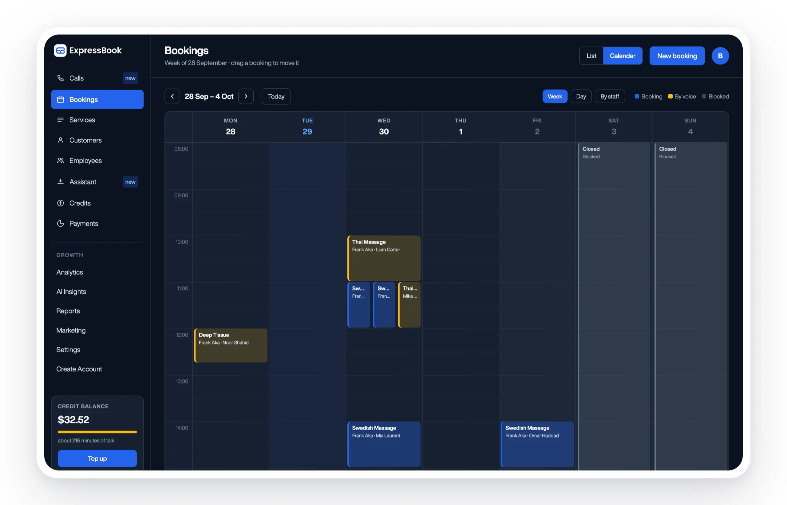
The platform syncs availability with Google Calendar, processes payments through Stripe, and pushes every transaction straight into QuickBooks or Xero, so the accounting side of your booking page never becomes a month end scramble. Staff selection, add-on pricing, and cancellation policies are all built into the page templates rather than requiring custom code. The mobile app lets you manage bookings from your phone, and the voice agent means visually impaired clients can book or ask questions without needing a sighted assistant to help them navigate a form.
If you want to see how a multi-service catalog or single-service hero looks running on your own business data, set up Expressbook: there is no subscription, so a small credit top-up is enough to test a redesign properly.
Frequently Asked Questions
What makes a booking page example worth copying?
A strong example pairs a layout suited to your service complexity with a clear CTA, visible availability, and transparent pricing above the fold. If any of those four elements is missing, the design isn’t worth copying regardless of how polished it looks.
Should I embed a booking widget or build a dedicated hosted page?
Embed when you already have a content-rich site and just need a booking function added. Host a dedicated page when the booking itself is the entire purpose of the visit, especially for landing pages built around paid traffic.
How many fields should a booking form have?
Cap it at five before payment: service, date, time, name, and contact information. Anything beyond that should move to a post-booking confirmation step rather than the initial form.
Do multi-step booking flows hurt conversion?
Not inherently, but each additional screen does cost some percentage of visitors. Multi-step only pays off when the booking genuinely involves choices like staff selection or add-ons that a single screen can’t handle cleanly.
What calendar and payment tools should a booking page support?
Google Calendar sync is the default most clients expect for availability, and Stripe is the most common payment processor built into modern booking templates. Both integrate directly into Expressbook’s booking pages without custom development.
Sources
- Booking websites – 23+ Best Booking Web Design Ideas 2026 | 99designs
- 21 Free Booking Form Templates (Most Flexible) 2026 – Colorlib
- 8 Beautifully Designed Booking Page Examples – Booqable
- Booking Website Templates & Page Designs | Webflow
- 63 Best Booking Industry Landing Pages Examples & Inspirations
Match whichever source you browse to your actual booking complexity and mobile traffic share before you commit to cloning it.