
Get More Bookings in 30–90 Days: Booking Page Roadmap for SMBs

Table of Contents

Owner reviewing mobile booking form

Five fixes drive most of the improvement on any service business booking page: a visible booking call to action, a form trimmed to essentials, mobile-first date and time pickers, one-tap payment options, and trust signals placed near the decision point. Businesses that tackle these in order typically see more completed bookings and fewer abandoned carts within weeks. A platform like Expressbook handles several of these natively, which shortens the path from checklist to results.


TL;DR:

  • Moving the “Book Now” button above the fold and removing unnecessary form fields can significantly increase reservation completion rates without technical investment.
  • Using mobile-optimized date pickers, clear touch targets, and placing payment buttons prominently are essential to reduce friction and lower mobile abandonment.
  • Displaying trust signals like verified reviews and security badges near the CTA enhances user confidence and improves conversion.
  • Speed and technical resilience, including fast load times and structured data, prevent lost bookings before users even see the form.
  • Small staged tests, focusing on high-impact changes like CTA wording and form design, outperform complete redesigns in boosting bookings over time.

Table of Contents

How Do You Optimize a Booking Page in 30, 60, and 90 Days?

Fixing a booking page isn’t a single project. It’s a sequence of small, measurable changes, each one building on the last. The mistake most service business owners make is trying to redesign everything at once, which delays results and makes it impossible to know which change actually moved the needle.

Quick wins (days 1-7)

These require no engineering and no budget approval, just attention.

  1. Move the “Book Now” button above the fold on both desktop and mobile.
  2. Delete every form field you don’t strictly need to confirm a reservation.
  3. Add one payment logo (Visa, Mastercard, Apple Pay) near the submit button.
  4. Rewrite your cancellation policy in one plain sentence, visible before checkout.
  5. Fix any typo or broken link in your confirmation and reminder emails.

High-impact tests to run in 30-60 days

Once the quick wins are live, start testing the changes that need a bit more setup but pay off in measurable lift.

  • A/B test a single-step form against your current multi-field version.
  • Test sticky booking summaries that follow the user down the page.
  • Trial Apple Pay and Google Pay against card-only checkout on mobile traffic.
  • Test moving testimonials from the footer to right beside the price.

90-day structural improvements

These need product or engineering time, so plan them once the quick wins and tests validate direction.

  • Real-time availability syncing across every calendar you use.
  • Progressive profiling so returning clients skip fields they already filled in.
  • Automated reminder sequences tied to your booking confirmation flow.

For each stage, track completion rate (bookings started versus finished) and time-to-complete. If a change doesn’t move either number within two weeks of traffic, roll it back and try something else. Small service businesses rarely have the traffic volume for weeks-long statistical purity, so directional movement over a few hundred sessions is often enough to make a call.

Form and Field Strategy: What to Collect Now vs After Booking

The single biggest lever on any reservation page is the number of fields between the visitor and the confirm button. Every additional field is a chance for someone to close the tab, and for a haircut or a massage appointment, most of what you’re asking for isn’t needed to hold the slot.

At minimum, a booking should require: service selection, date and time, name, and a phone number or email for confirmation. Everything else, intake forms, preferences, marketing consent, referral source, can wait until after the slot is reserved.

  • Service type and duration
  • Preferred date and time
  • Name
  • One contact method (phone or email, not both upfront)
  • Payment method, only if a deposit is required to hold the slot

This is the core of progressive profiling: collect the minimum to convert, then ask for the rest through a confirmation page, a follow-up email, or an account setup step once the person has already committed. Practitioner guidance on travel booking forms frames this as a single-step soft ask, where each interaction feels low-effort because you’re never asking for more than the next immediate decision.

Small technical details matter more than most owners assume. Setting the correct input type, tel for phone numbers, email for addresses, number for guest counts, triggers the right mobile keyboard automatically and cuts typing errors. A phone field that opens a full alphabetic keyboard on an iPhone is a tiny but real source of drop-off.

Multi-step forms make sense when the booking itself is complex: multiple services, multiple staff members, group bookings, or add-ons that change the price. A single page can’t clearly present five decisions without overwhelming the layout, so breaking it into stages, service, then time, then details, keeps each screen simple. For a basic single-service appointment, a single-step form usually converts better because there’s nothing complex to stage.

Pro Tip: Test your form on a mid-range Android phone, not just an iPhone. Autofill behavior and keyboard types render differently across browsers, and that’s often where the biggest, most invisible friction lives.

Mobile-First UX and Payment Optimization

A majority of travel bookings now happen on mobile devices, and that share keeps climbing, according to industry data cited by Atlas Perk. Service businesses see a similar pattern: a client booking a haircut or a training session is almost always doing it from a phone, often between other tasks. If your booking page was designed on a desktop monitor and never re-tested on a phone, you’re optimizing for the smaller share of your traffic.

Mobile conversion rates lag desktop conversion rates across travel and tourism sites broadly, and the gap traces back to friction that desktop users don’t experience: small tap targets, calendar widgets that require zooming, and payment forms that weren’t built for a thumb.

Fixes worth prioritizing include adopting booking software for libraries that offers customization and simple UX improvements to maximize booking effectiveness.

  • Tap targets at least 44 by 44 pixels, so buttons don’t require a second attempt.
  • Native date and time pickers instead of custom calendar widgets that render poorly on smaller screens.
  • Correct keyboard types for every field (numeric, email, phone).
  • Apple Pay and Google Pay buttons placed directly above or beside the primary submit button, not buried in a payment method dropdown.
  • A sticky summary bar showing service, time, and price as the user scrolls, so they never lose context.
  • Session persistence, so a booking survives an accidental app switch or a dropped connection.

On average, nearly 70% of online shopping carts get abandoned before checkout completes, a benchmark that applies just as directly to service bookings as it does to retail.

Payment failure handling deserves its own attention. When a card declines, don’t just show a red error and reset the form. Tell the person exactly what happened (“Your card was declined, try another card or payment method”) and preserve every other field they already filled in. Losing a completed form because of one failed payment attempt is one of the most avoidable ways to lose a booking that was already won.

Trust, Social Proof, and Pricing Transparency

Trust signals only work if they sit where the decision actually happens. A testimonials page linked in your footer does almost nothing for someone hovering over the “Confirm Booking” button. Positioning matters as much as content: placing trust signals next to pricing and the call to action consistently outperforms burying them elsewhere on the site.

  • Show a handful of real, verified reviews directly beside your price or CTA, not in a separate section.
  • Display a security badge (SSL, PCI compliance) near the payment field, where the anxiety about entering a card number actually happens.
  • State your cancellation and refund policy in one sentence right in the booking summary, never a link buried in the footer.
  • Match your proof to your audience: a med spa should show before-and-after style client feedback, while a bookkeeping service should show client tenure or years in business.

Microcopy carries more weight than most business owners give it credit for. A line like “You won’t be charged until 24 hours before your appointment” next to the payment field removes a specific, common hesitation. So does “Free cancellation up to 48 hours before your visit.” These aren’t decorative; they answer the exact question running through a hesitant visitor’s mind right before they close the tab.

Page Speed, Technical Resilience, and Basic Booking-Page SEO

A booking page that takes four seconds to become interactive on a mid-tier phone is losing customers before they’ve seen a single field. Prioritize Time to Interactive on mobile specifically, not just your desktop Lighthouse score, since that’s where most bookings originate.

  • Cut render-blocking scripts, especially third-party analytics and chat widgets that load before your booking form does.
  • Make sure your availability check doesn’t wait on a slow external calendar API before showing the calendar grid, load a cached view first, then refresh live.
  • Compress and lazy-load images below the fold; a staff photo gallery shouldn’t compete with your form for bandwidth.
  • Defer non-critical scripts (marketing pixels, review widgets) until after the core booking flow has rendered.
  • Add structured data (Schema.org’s Service and LocalBusiness markup) so search engines can display your hours, pricing, and location directly in results.

None of this is glamorous work, but a page that loads slowly on a spotty mobile connection loses bookings before your copy, your pricing, or your trust badges even get a chance to do their job.

Booking Flow Architecture: Staging, Upsells, and Progress Cues

The order in which you ask for decisions shapes how far people get through your funnel. Ask for the hardest or most optional decision first, and you’ll lose people who would have booked the core service happily.

  1. Present the core service and time slot first, nothing else competing for attention.
  2. Once the core booking is confirmed, offer optional add-ons (a deep-tissue upgrade, an extra training session, a room upgrade) with clear, individual pricing.
  3. Use a simple progress indicator (Step 1 of 3) so users always know how much is left, especially on multi-step flows for complex bookings.
  4. Keep a sticky summary visible throughout so price and time never disappear from view.
  5. For high-value or complicated bookings (multi-day retreats, group sessions, corporate packages), offer a phone number or live chat option as an escape valve for anyone who hits a question the form can’t answer.

Upsells should never feel mandatory. A checkbox that’s pre-selected by default, hoping the user won’t notice, tends to generate refund requests and bad reviews rather than extra revenue. Keep every add-on opt-in, priced clearly, and easy to remove.

Measure, Test, and Learn: KPIs and Experiment Ideas

You can’t optimize what you haven’t defined. Set up event tracking for every stage of the funnel: page view, form start, field completion, payment attempt, and confirmed booking. Without that breakdown, you’re guessing which part of the flow is actually losing people.

  • Track completion rate: bookings started divided by bookings finished.
  • Track time-to-complete, since a form that takes over two minutes is a candidate for trimming.
  • Track payment failure rate separately from form abandonment; they have different fixes.
  • Track device-level conversion, since mobile and desktop often need different solutions entirely.

Prioritize tests by expected impact and effort. Moving your CTA above the fold takes an afternoon and often produces the largest single lift you’ll see all quarter. A full redesign of your booking flow might take a quarter and produce a smaller gain by comparison. Structured, staged experiments, tackling the highest-friction step first rather than redesigning everything at once, consistently outperform sweeping overhauls.

When you see a lift, check whether it holds across both mobile and desktop before rolling it out permanently. A change that helps desktop users but confuses mobile users, or vice versa, isn’t a clean win, it’s a trade you need to make consciously.

Pro Tip: Never judge a test after less than a week of data, even if the early numbers look dramatic. Weekday and weekend booking behavior often differs enough to flip your conclusion by Sunday.

Copy and Microcopy Playbook for Higher Conversions

Words on a button change behavior more than most business owners expect. “Book Now” is generic; “Confirm My Appointment” or “Reserve My Spot” tends to perform better because it names the specific action being completed.

  • CTA copy: “Book My Appointment,” “Reserve This Time,” “Confirm Booking,” each naming a specific, low-risk action.
  • Reassurance near payment: “Your card details are encrypted and never stored on our servers.”
  • Error recovery: instead of “Invalid input,” try “That phone number needs 10 digits, no dashes needed.”
  • Confirmation copy: “You’re all set. A confirmation and reminder are on their way to your inbox.”

Test small variations of each, one CTA phrase against another, one error message against another, and give each test enough bookings to trust the result rather than reacting to the first day’s numbers.

ExpressBook in Practice: Feature Match and Proof Points

Most of the checklist above requires stitching together several tools, a calendar plugin, a payment processor, a separate reminder system, unless your booking platform already does it natively. Expressbook was built to close that gap for salons, gyms, wellness clinics, and independent professionals running their own booking pages.

  • A dedicated mobile app for both customers and admins means real-time availability updates on any device, not just desktop.
  • Automatic syncing with QuickBooks and Xero eliminates the manual data entry that eats into a manager’s Sunday night.
  • Built-in automated reminders reduce no-shows without a separate email tool.
  • Real-world booking page examples show how service businesses across industries structure their forms and pricing displays.
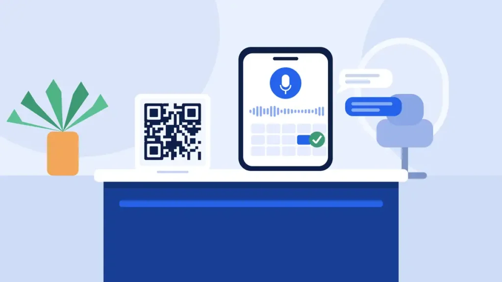
  • A voice agent lets visually impaired customers book appointments and get answers to business questions without needing to navigate a visual interface.

Businesses report saving substantial time on administrative tasks after switching from manual scheduling to a synced platform. For a salon owner or solo therapist, that’s nearly a full workday returned every week.

Author Perspective: Trade-Offs and Practical Constraints for SMBs

Author Perspective: Trade-Offs and Practical Constraints for SMBs — overview diagram

The instinct to build a “complete” booking page, every field, every option, every upsell, is usually the wrong instinct for a small business. Completeness serves the business’s curiosity about its customers. Speed serves the customer’s actual goal, which is getting a slot confirmed in under sixty seconds.

The real constraint isn’t design skill, it’s staff time. A solo owner can’t A/B test five variants a month. Pick one change, run it for two weeks, decide, move on. Skip the elaborate personalization engine before you’ve fixed a form field that’s still asking for a fax number. Small, sequential fixes beat ambitious redesigns almost every time, because they actually ship.

— serge

ExpressBook Next Steps: Trial, Audit, and Templates

Every fix in this playbook, the visible CTA, the trimmed form, the one-tap payment button, the trust signals near checkout, maps directly to something Expressbook handles out of the box rather than something you have to bolt on with three separate plugins. Real-time availability, QuickBooks and Xero syncing, automated reminders, and a mobile app for both customers and staff come built in, so the 90-day roadmap above compresses into weeks rather than a quarter of engineering time.

Expressbook

Expressbook offers up to 3 months of free trial for businesses that want to test the platform against their current setup before committing to anything. Start with a 7-point audit of your current page using the quick-wins list above, enable Apple Pay and Google Pay through your account settings, and launch a 30-day test comparing your old form against a trimmed one. If you run a salon, spa, or wellness practice specifically, the industry-specific templates for beauty and aesthetic businesses are a faster starting point than building your booking page from a blank template.

Sources

Table of Contents

Related Blogs

Related Articles

Customer checking an appointment booking confirmation

Build or Buy: Developers’ 3 Essentials for Booking Confirmation Pages

Developer checklist for booking confirmation pages: UX, state machine logic, print/PDF and QR tips, and when to pick a turnkey flow.
Operator reviewing an opened waitlist slot

5 Waitlist Email Templates That Add Claim Windows for Operators

Five editable waitlist email templates for salons and clinics, with timing and claim window rules plus automation tips to improve fill rates.
Locked server cabinet representing secure booking data

90 Day Plan to Secure Client Booking Data for Small Businesses

90 day plan for small service businesses to secure client booking data: AES 256, TLS 1.3, RBAC, vendor vetting, and a consolidation checklist.