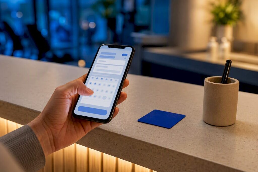
A quality booking confirmation page delivers three things without exception: an unmistakable success signal, a booking reference the customer can look up later, and a next action, whether that’s adding an event to a calendar or downloading a receipt. Platforms like Expressbook build this logic in by default, but the same rules apply whether you’re coding it from scratch or configuring a template.
TL;DR:
- Using a booking reference number with a copy-to-clipboard feature and clear expiration rules is essential for easy customer lookup and support ease.
- Supporting lookup by email or confirmation number via fallback search methods reduces support tickets and improves user experience.
- Including reference numbers in confirmation emails, SMS with secure links, and clear barcode fallback text ensures reliable delivery and scanning.
- Recognizing that a well-designed error and conflict state reduces support calls more than visual polish on the success page.
- Automating confirmation and reminder flows with a platform like Expressbook can save development time and improve data reconciliation with accounting tools.
Table of Contents
- Booking Confirmation Page Design Patterns Worth Copying
- The Booking Confirmation Checklist Every Team Should Run
- Building the Confirmation Screen: State Machines and Retrieval Logic
- Getting Confirmation Details to Customers: Email, SMS, and Print
- Confirmation Page Copy That Actually Cuts No-Shows
- How Expressbook Approaches Confirmation Screens
- What Actually Matters in a Booking Confirmation, and What’s Overrated
- Skip the Build: What Expressbook Handles for You
- Sources
Booking Confirmation Page Design Patterns Worth Copying
Most confirmation screens fall into one of a handful of proven layouts. Picking the right one depends on what was booked and how much detail the customer actually needs at that moment.
- Success banner with inline details. Best for quick appointments, a salon slot or a gym class, where a green checkmark, the date, and a “you’re all set” line are enough.
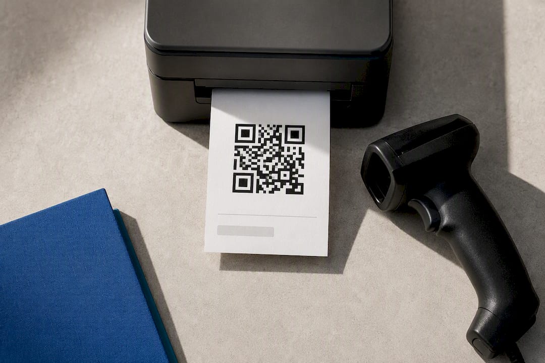
- Ticket-style pass with a perforated stub and QR code. Standard for events and anything scanned at a door; keep the scannable element large and isolated from decorative graphics.
- Compact receipt-style summary. Fits paid services with add-ons, showing line items, tax, and total the way a payment confirmation page would.
- Modal or overlay confirmation. Works for single-step checkouts where sending the user to a whole new page feels like overkill.
For raw layout inspiration, the Frontend Mentor hotel booking confirmation challenge is a solid reference for responsive spacing and typography hierarchy. Design galleries like Mobbin are also worth a scroll before you sketch your own version, since seeing five real reservation confirmation screens back to back reveals patterns that a single mockup won’t.
The Booking Confirmation Checklist Every Team Should Run
Before shipping any confirmation screen, run it against this list. Skipping even one item tends to generate support tickets down the line.
- A visible success state paired with short, reassuring copy, not just a color change.
- A booking reference number with a copy-to-clipboard button and clear expiration or validity rules.
- A timezone-aware reservation summary: date, time, location, attendees, and service duration.
- Payment details, including totals, taxes, the last four digits of the card used, and a link to the refund or cancellation policy.
- Primary calls to action: download or print, add to calendar, manage the booking, and contact support.
- Security-conscious display of payment data (masked, never in full) and a reminder that official communications come from your own domain.
Pro Tip: Never put a customer’s full name, appointment type, or health details in an SMS confirmation. Keep the text message to a reference number and a secure link, then let the linked page hold the sensitive summary behind login or reference lookup.
Building the Confirmation Screen: State Machines and Retrieval Logic
A booking confirmation screen isn’t static content. It’s the visual output of a state machine, and treating it that way prevents most of the bugs that show up in production. The typical states are idle, submitting, success, conflict, and error, and each one carries distinct UI responsibilities.
- Idle: the form is ready; no network call has fired yet.
- Submitting: disable the submit button, show a spinner, and block duplicate taps.
- Success: render the confirmation details, reference number, and next-step buttons.
- Conflict: the slot got claimed by someone else a beat before you did; show a clear message and offer alternative times rather than a generic error.
- Error: distinguish network failures from validation failures, and always give the user a retry path.
One working example of this pattern lives in an open-source booking confirmation component that fetches by URL parameter and renders a printable pass, which is a useful reference if you want to see the fetch-by-reference logic end to end.
For retrieval, don’t rely solely on a URL parameter. Validate the reference ID format client-side before firing the fetch, and offer a fallback search by email for users who lost the link. Industry practice, documented in SAP’s Travel accelerator guidance, is to support lookup by confirmation number or account email as parallel paths, not one or the other.
On the print and PDF side, a dedicated @media print stylesheet matters more than most teams expect. Server-generated PDFs tend to render QR codes more reliably across printers than client-side canvas exports, and testing barcode density at common printer DPI settings avoids the classic problem of a code that looks fine on screen but won’t scan off paper. Always print the reference number as fallback text next to any barcode. For downloadable passes, keep card numbers and personal data out of the DOM entirely, and use a server-signed token for QR validation so a venue scanner can verify authenticity without exposing booking internals.
Getting Confirmation Details to Customers: Email, SMS, and Print
Delivery channel choice shapes how much detail you can safely include and how long that detail needs to stay retrievable.
- Email should carry the reference number in the subject line, an HTML body with the key summary, and either a PDF attachment or a stable link back to the hosted confirmation. Always include a resend option for the inevitable “I can’t find it” request.
- SMS works best minimal: reference number plus a secure short link, nothing more. Set an expiry policy on that link and follow basic SMS link safety practices so it doesn’t read like a phishing attempt.
- Printable passes need legible barcodes and the essential metadata visible without a scanner. Test the print CSS in at least two browsers; rendering differences here are more common than developers expect.
- Lookup flows should tie the reference to an email or account, with a “Find my booking” form that accepts either input.
Enterprise systems like OPERA Cloud build templated confirmation email and SMS sending directly into their reservation management, which is worth studying if you’re deciding how much of this to build versus configure.
Confirmation Page Copy That Actually Cuts No-Shows
The words on a confirmation screen do real work. A clear “what to bring” note and a one-tap add-to-calendar button prevent more no-shows than any reminder campaign fixes after the fact.
- Show timestamps in the customer’s local timezone, not the business’s, and label it so there’s no ambiguity.
- Pair email reminders with SMS for time-sensitive bookings, and let customers opt in or out of each channel separately.
- Put reschedule and cancel buttons directly on the confirmation page instead of forcing a support email.
- Keep upsell offers and promotions off the primary confirmation region. A reservation confirmation screen cluttered with a discount banner buries the one thing the customer actually opened the page for.
Pro Tip: Test your reminder cadence against real cancellation data before locking it in. A single reminder 24 hours out often reduces no-shows more than three scattered messages that start to feel like spam.
How Expressbook Approaches Confirmation Screens
Expressbook builds branded booking pages with automated confirmation emails and SMS, downloadable passes, and one-tap calendar links baked into the same flow, then syncs the resulting payment and client data straight to QuickBooks and Xero. That last part matters more than it sounds: a confirmation page that looks great but leaves a bookkeeper reconciling manually at month-end hasn’t actually solved the problem.
The platform also ships a dedicated mobile app for both customers and admins, so a booking confirmation is visible and manageable from a phone without a browser tab, and a voice agent that lets visually impaired customers book appointments and get answers to business questions without needing to read a screen at all.
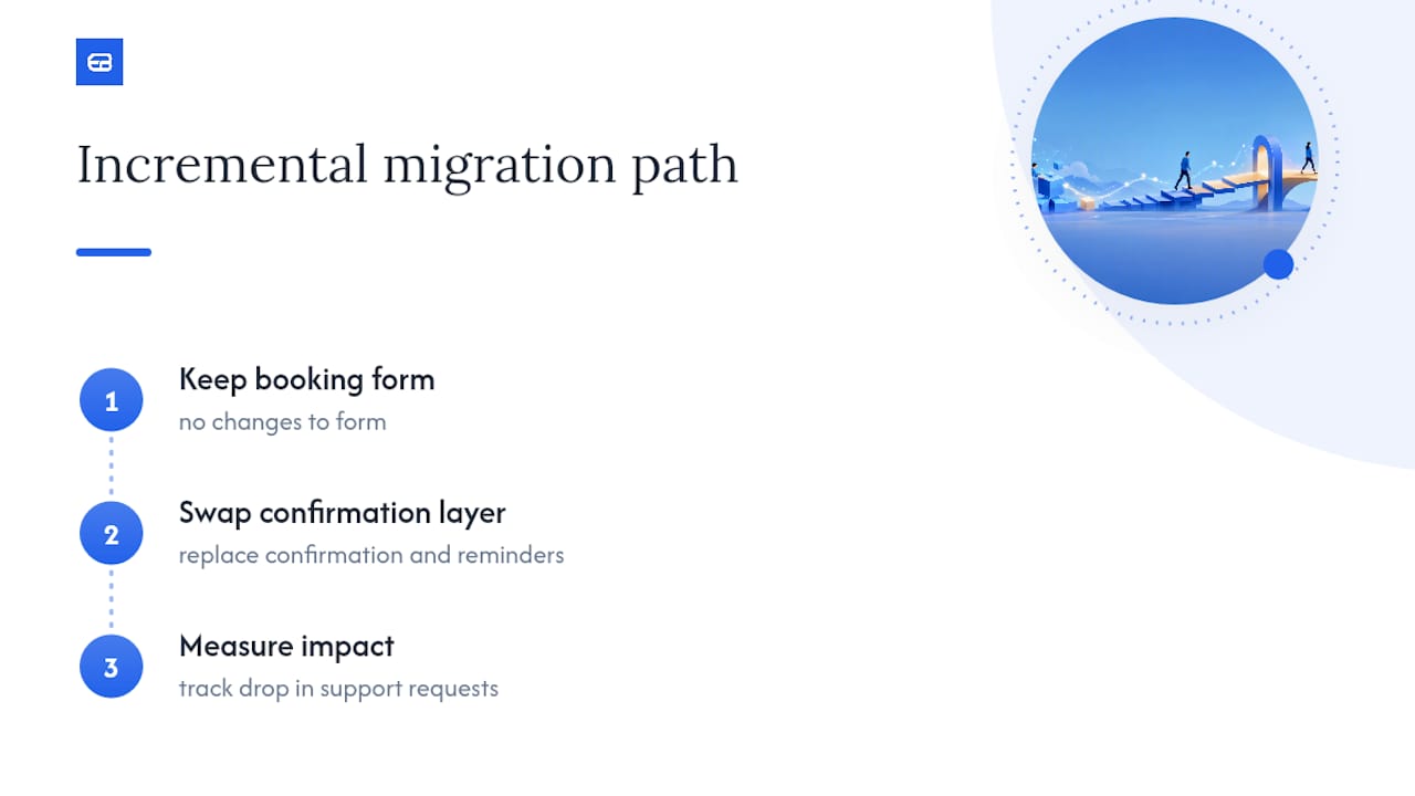
For teams moving off a homemade confirmation flow, the practical path is usually incremental: keep your existing booking form, swap the confirmation and reminder layer first, and measure the drop in support requests before touching anything else.
What Actually Matters in a Booking Confirmation, and What’s Overrated
Most advice on this topic obsesses over visual polish, big checkmarks, confetti animations, gradient success banners, while underweighting the two things that actually prevent support tickets: a reliable reference number and a delivery channel that survives a lost email. A confirmation page can look mediocre and still work perfectly if a customer can find their booking six weeks later using nothing but their email address.
The conventional wisdom also treats the confirmation screen as the finish line. It isn’t. The real test happens when something goes wrong, a double-booked slot, a card that declined after the page rendered, a customer who never got the text. Teams that design the conflict and error states with the same care as the success state end up with far fewer angry calls than teams that polished the happy path and left everything else as a generic “something went wrong” message.
If you’re prioritizing one thing first, make it retrieval. A booking status update a customer can’t find is worse than no confirmation page at all, because it creates the illusion that the system is broken.
— serge
Skip the Build: What Expressbook Handles for You
Expressbook is the alternative to building a confirmation flow from scratch: instead of wiring together a state machine, a PDF generator, and an SMS provider yourself, you get branded booking pages, automated confirmation emails and texts, downloadable passes, and calendar links running out of the box, all synced automatically to QuickBooks or Xero.
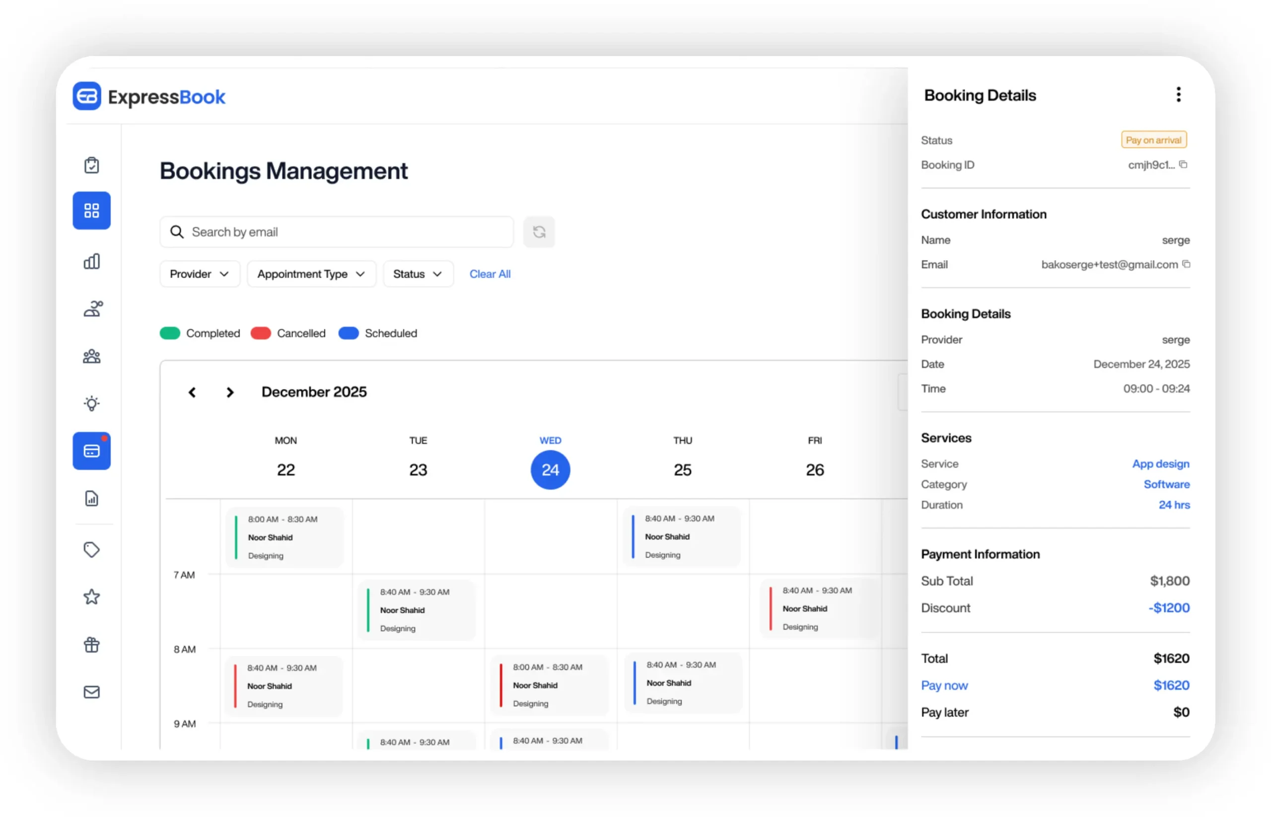
Every plan includes a mobile app and a voice agent that lets visually impaired customers book and ask questions without visual navigation. If you’d rather see how a managed flow handles real-time updates and rescheduling before committing, that’s a reasonable next step too.
Expressbook offers up to three months free. to test the full platform against your own booking volume before you decide anything. Start the trial and get a working confirmation and reminder setup running this week instead of next quarter.
Sources
- SAP Travel accelerator — booking retrieval and delivery practices
- Ticket-Booking-System — BookingConfirmationPage.jsx (example implementation)